Skate Against
Suicide

The project focused on revitalizing the communication strategy and logo design for Skate Against Suicide, a Dublin-based nonprofit advocating mental health awareness through skateboarding. The objective was to refine their visual identity and messaging to better resonate with their target audience.
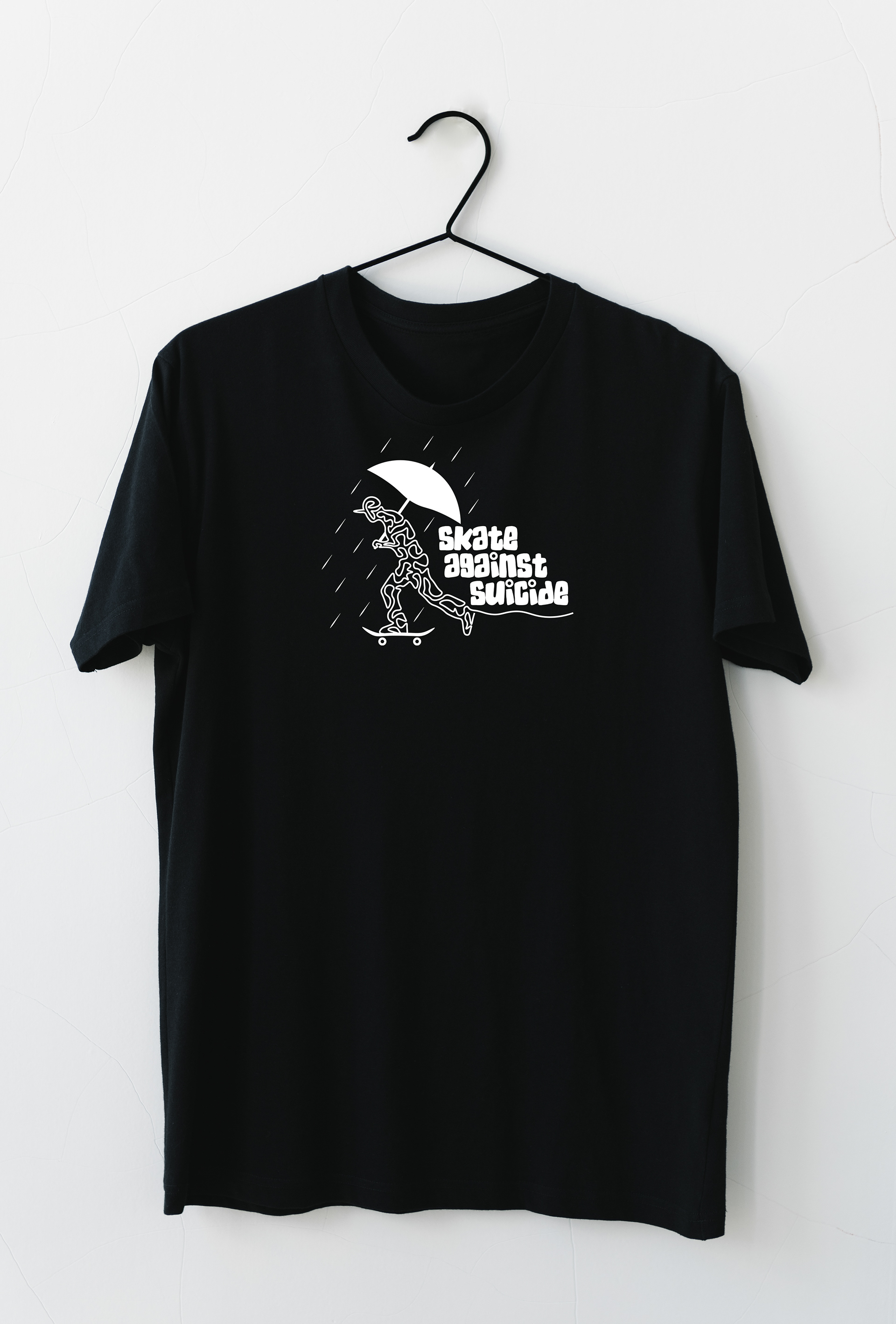
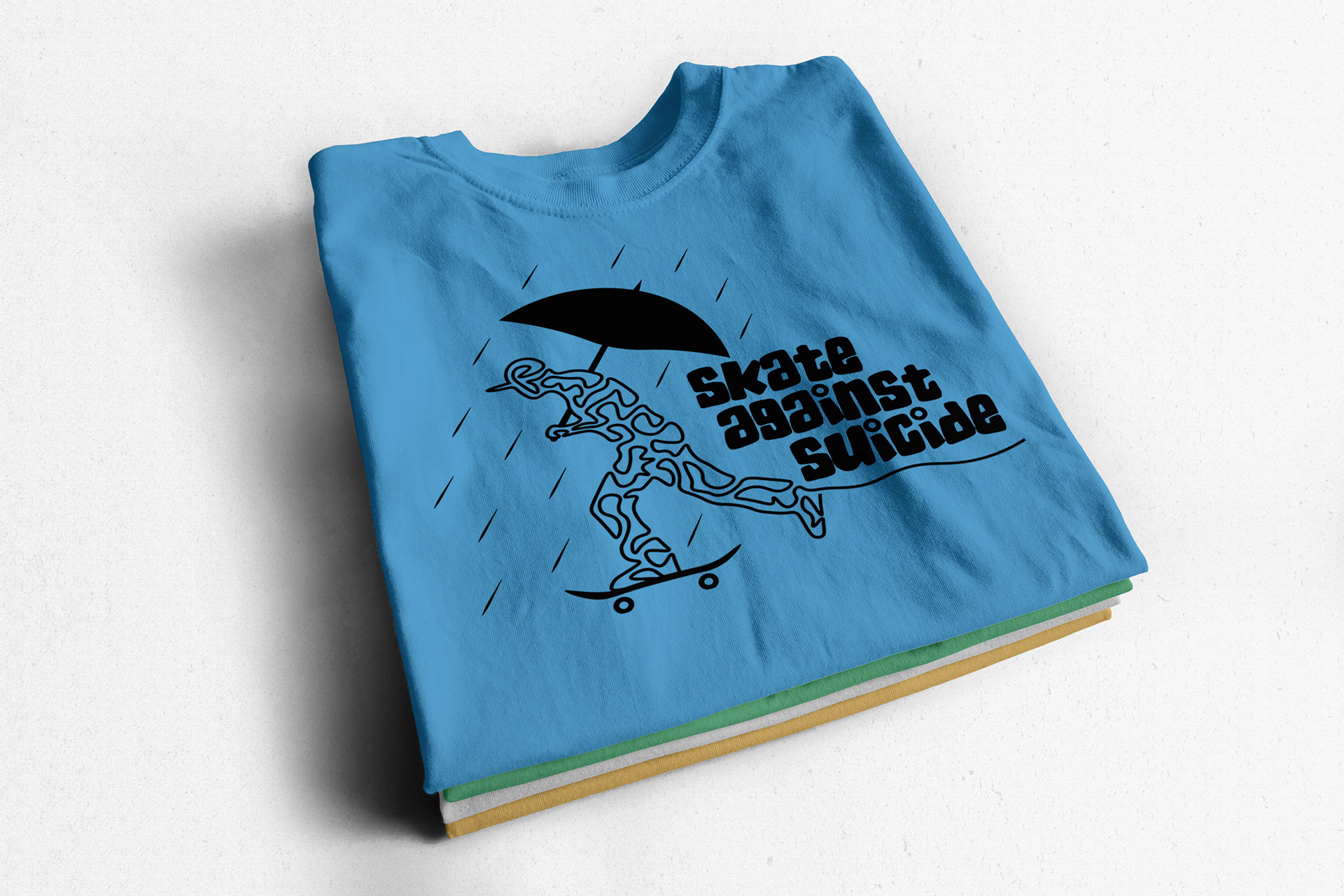
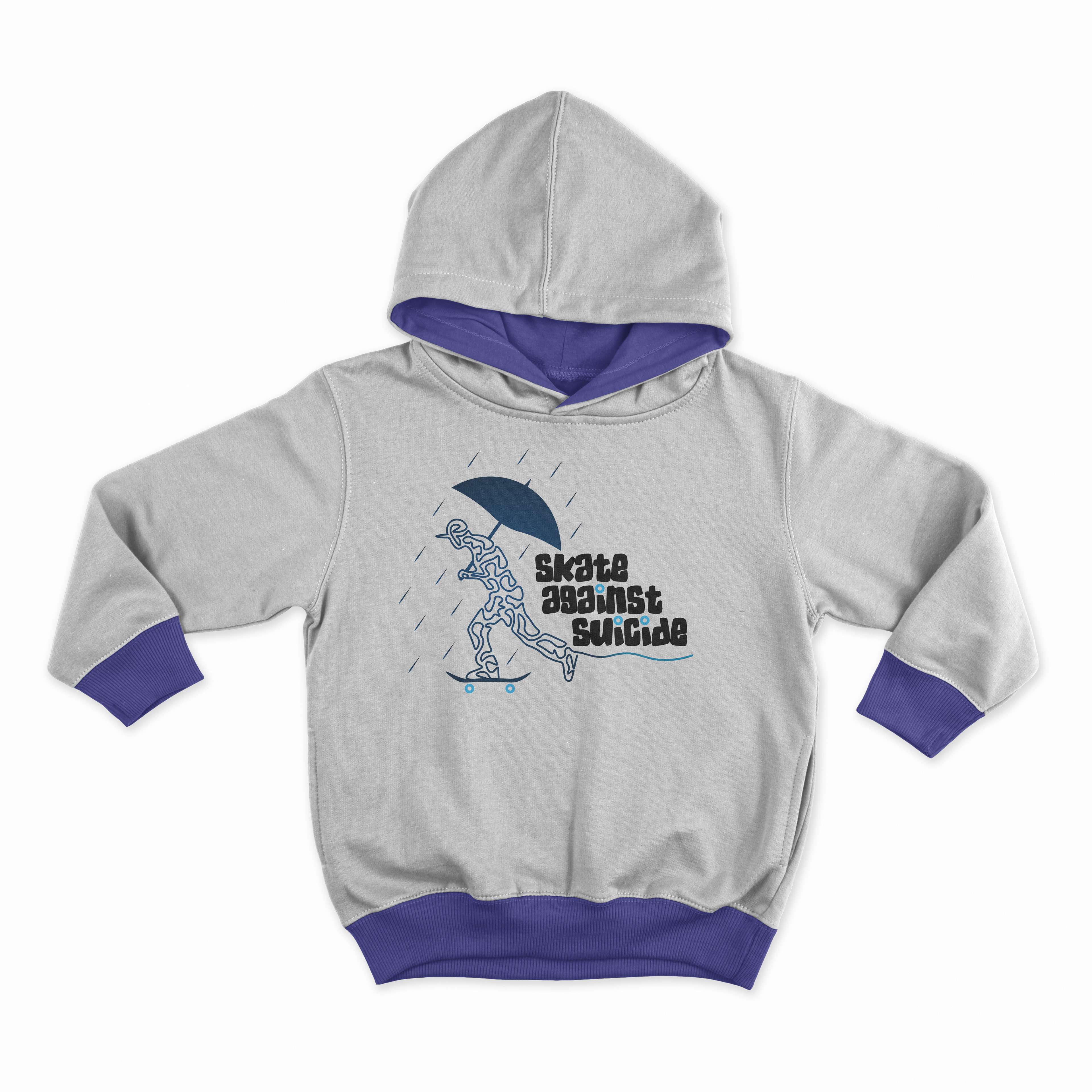
The logo redesign preserved key elements while updating its aesthetics to align with the organization’s mission and values. Additionally, the project involved creating compelling print materials and creation of merchandise such as clothing and accessories. These items were designed to strengthen brand recognition and support fundraising efforts for Skate Against Suicide.
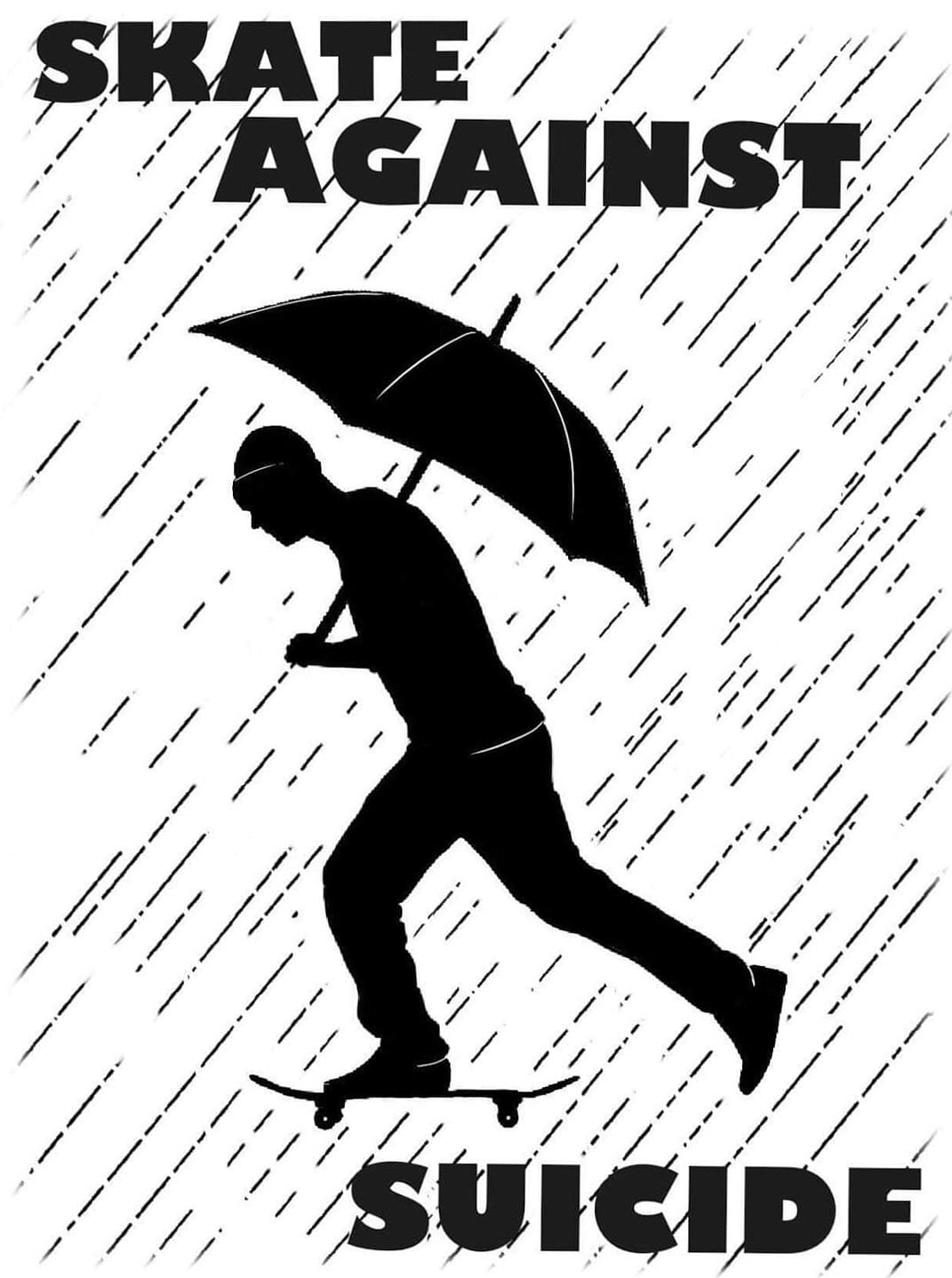
Old Logo
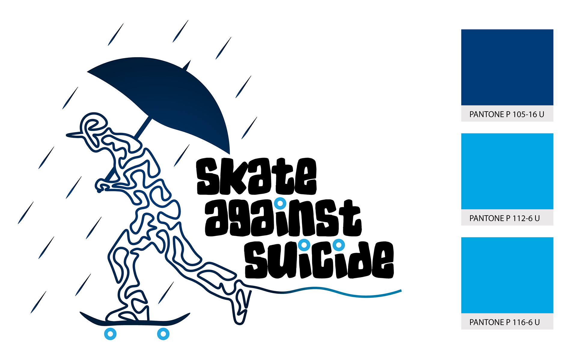
Redesigned Logo

Black Version of the Logo
White Version of the Logo
Firstly, I conducted iterative sketches and digital drafts to explore streamlined versions of the logo. This involved removing extraneous details while preserving the essence of the skater, rain and umbrella motif. By simplifying the illustration, the goal was to create a more cohesive and recognizable symbol that would resonate immediately with viewers.
The concept of leaving behind all troubles while on a skateboard emerged as a central theme. This idea inspired a symbolic representation through the visual element of a "tangled person" with a string trailing behind, symbolizing the act of unravelling and letting go.


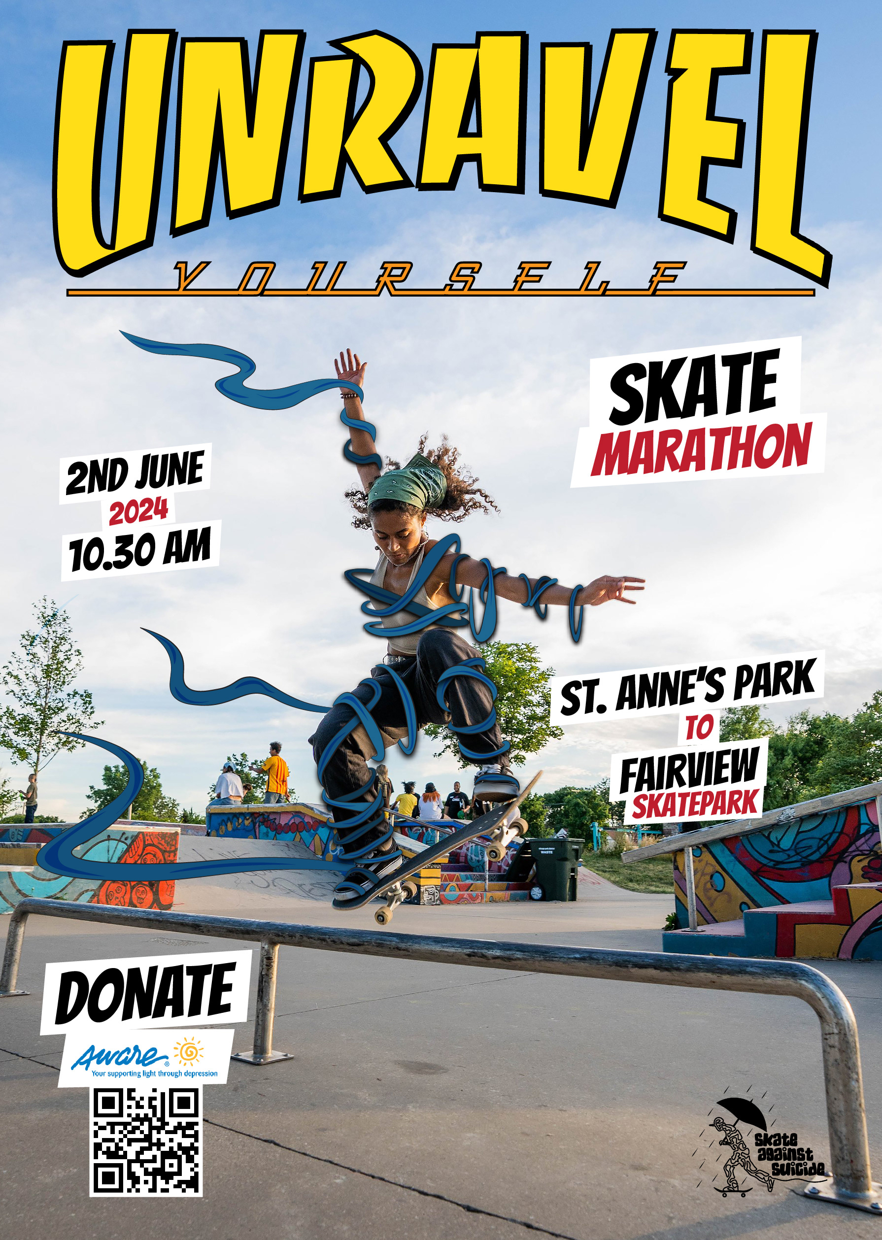
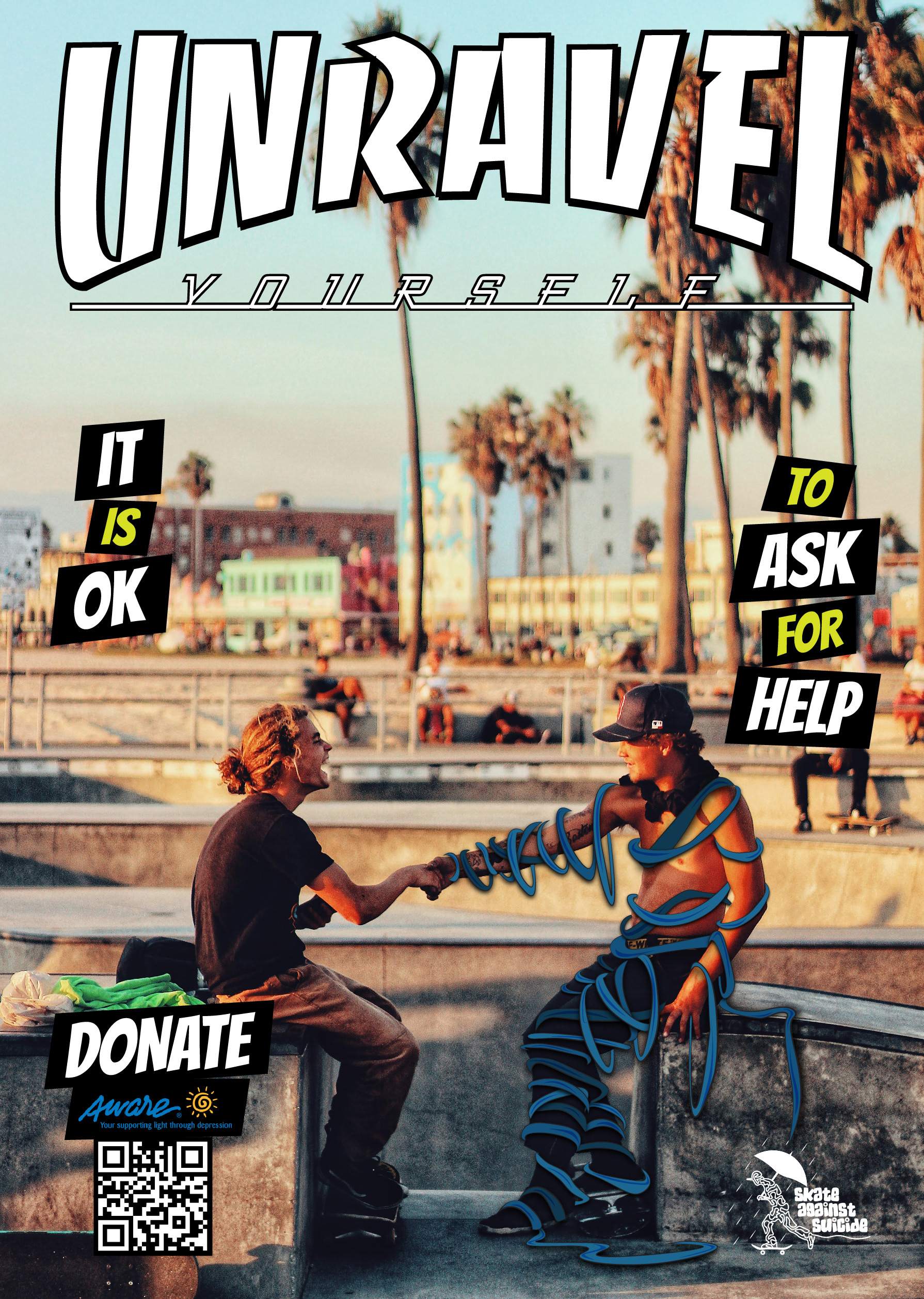
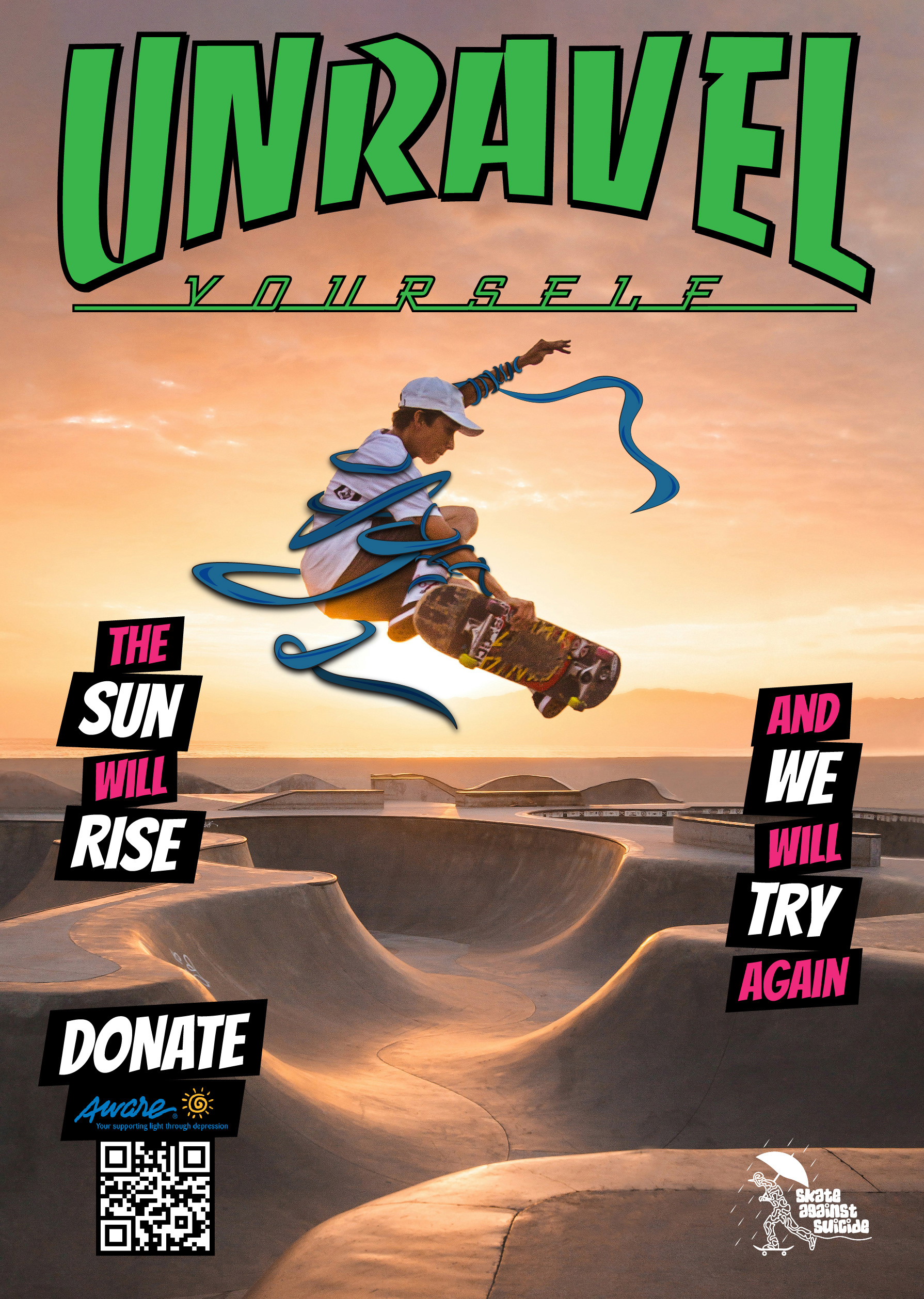
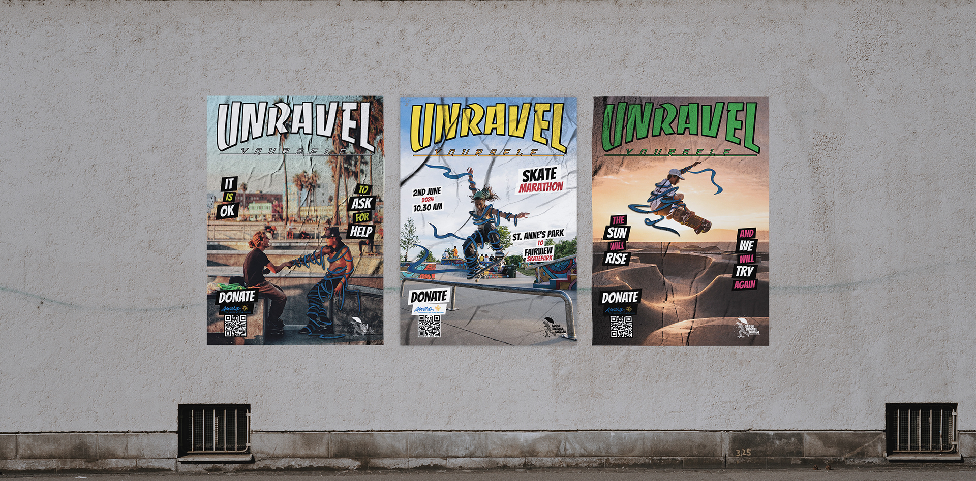
As part of the project, I designed a series of posters inspired by the vibrant aesthetic of Thrasher Magazine covers. These posters were meticulously crafted to resonate deeply with the skateboard community while advancing the mission of Skate Against Suicide. Drawing on the iconic style of skateboard culture, the posters effectively communicate messages of mental health awareness in a visually engaging manner.
Each design integrates key elements of Skate Against Suicide’s brand identity, including the unravelled motif from the logo, symbolizing the act of unravelling and letting go. This motif inspired a compelling slogan for the posters and visual language, emphasizing themes of resilience and mental liberation within the skateboarding context.
The goal of these posters was not only to raise awareness but also to foster a sense of community engagement and support for the cause. By capturing the spirit of skateboarding culture and incorporating symbolic elements from the logo, the posters served as powerful visual tools to spark conversations and promote positive mental health practices within the community.
Through this creative approach, the posters contributed to enhancing Skate Against Suicide’s visibility and impact, reinforcing their commitment to mental health advocacy through innovative and culturally relevant communication strategies.